S+S
A 20-year interior-design studio's history, playable as a deliberately simple Mario — built solo in three weeks as a birthday gift to its founders.
Overview
S+S is a small browser platformer that turns twenty years of an interior-design studio into a playable Mario. Sundukovy Sisters — a Forbes-featured studio run by Ira and Olya Sundukov — wanted an unusual gift for the founders' birthday: a game. Not a serious one. Deliberately simple, pixelated, "looks plain but has soul." Four levels, each covering five years of the studio's history, with the founders themselves as the heroes. I built it solo in three weeks. The result was played by the whole team at the founders' corporate birthday party, and the link is still live today.
The brief
The ask was specific and charmingly blunt: "We want a Mario about girls, in three weeks, as a gift." The written brief filled in the shape: - The feel of Super Mario — ideally that exact kind of movement. - Two playable characters, Ira and Olya, drawn in pixel art from photos. You control one; the other follows automatically. - Four levels, each representing five years of a twenty-year history. - Instead of mushrooms and question blocks, you collect attributes from the studio's real projects, with a "collected 2/10" counter at the top. - A mini-boss at the end of each level — "the pickiest client?" - A Super Mario-style finale: the heroes reach their dream project, fireworks, victory music. Constraints were the whole game design problem: a fixed three-week commission, solo, full-time — and the artwork did not exist yet.
Working without assets
Because none of the project visuals existed at the start, I built the framework first — movement, collisions, collectibles, the level loop — and pulled the content from the client in parallel. The key question I sent back was simply: "Do you have a description of the studio's path for the first five years, with visual examples, so I can lay out the levels?" The answer became the level design: each milestone, award and even each of the founders' five children became an object to place.
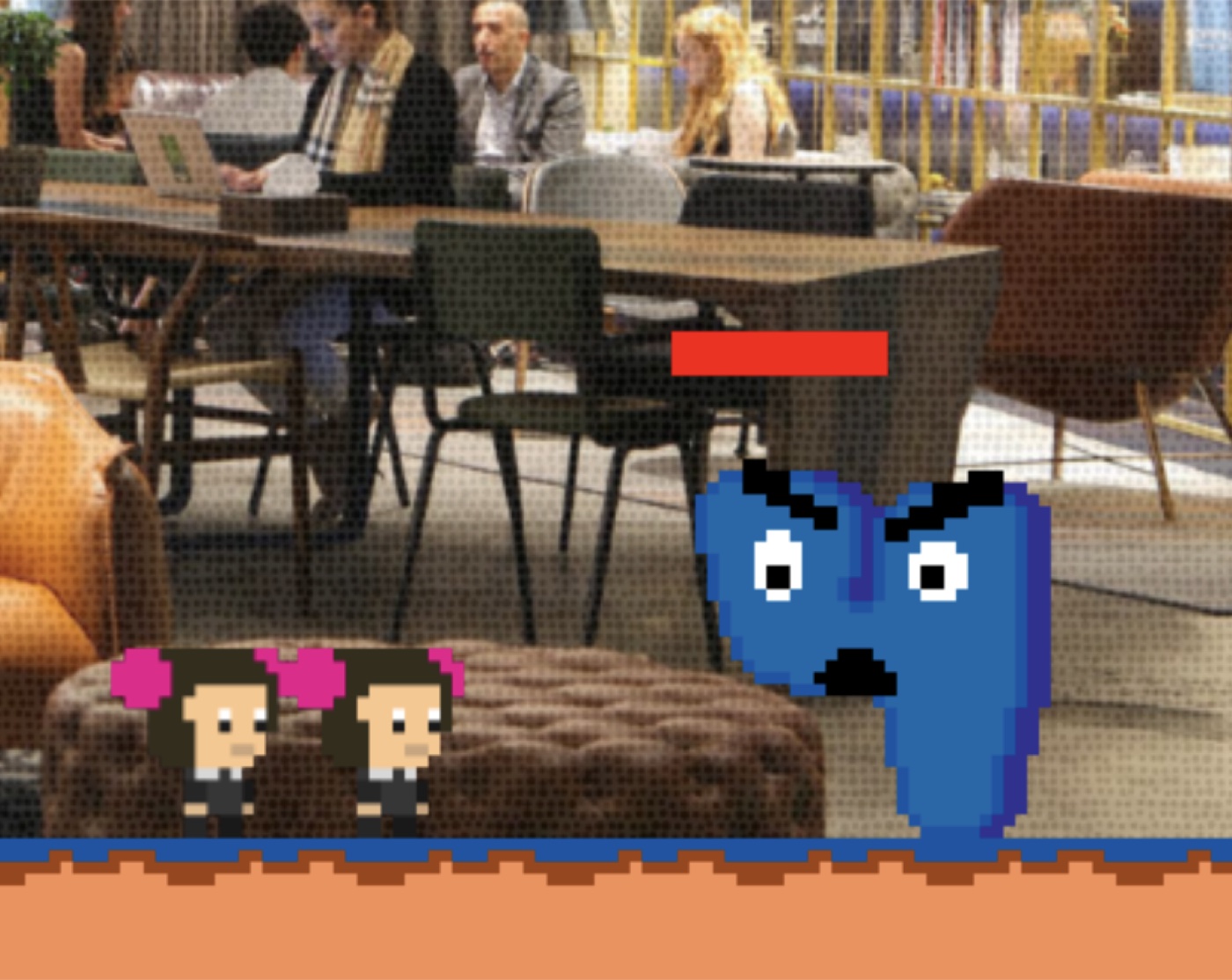
The studio's real interiors, in pixels
Both sisters on a dithered project backdrop
The two sisters in their pixel form, with one of the studio's real restaurant interiors behind them — dithered down to the game's resolution so it reads as terrain rather than a photo.
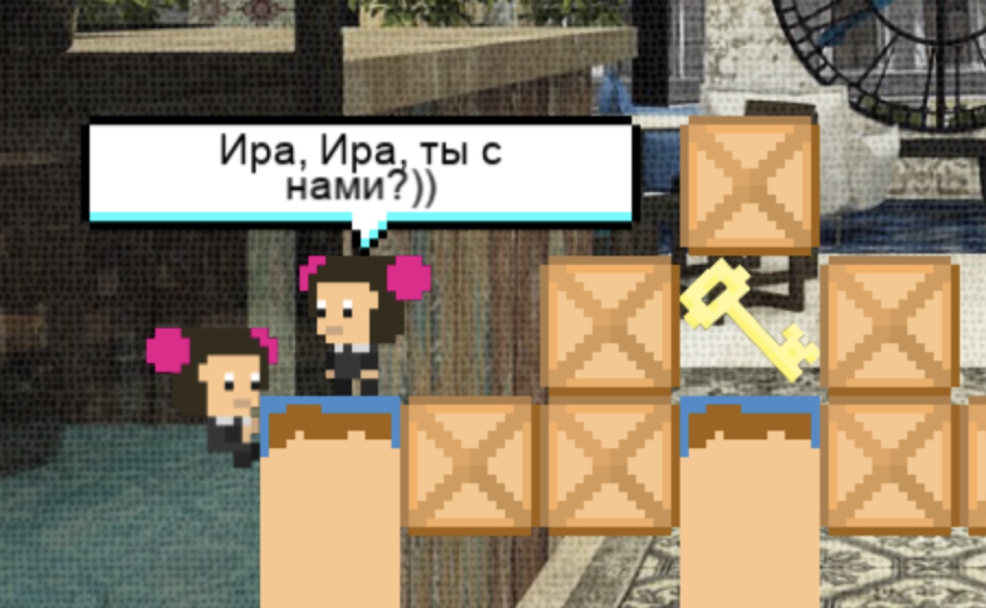
History as a platformer
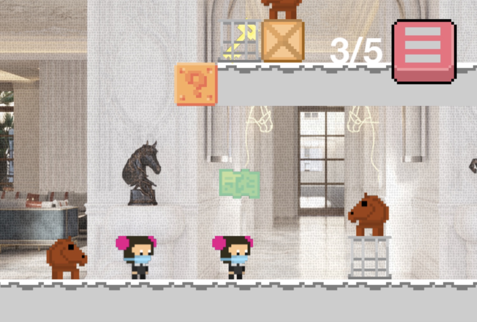
Each of the four levels is a five-year era, opening with a line in the studio's own voice: - 2004–2010 — "We want our design to be recognizable!" - 2011–2016 — "Those Sundukovy again!" - 2017–2020 — "International recognition awaits us!" - 2020–2024 — "Heading for Dubai and Cyprus!" The collectibles are the real timeline: the first Accor project, the move into the international market with Pullman Berlin, Paris 2017, Designer of the Year 2018, the Dubai and Cyprus offices. Twenty years told as a side-scroll.
Teaching without a tutorial wall
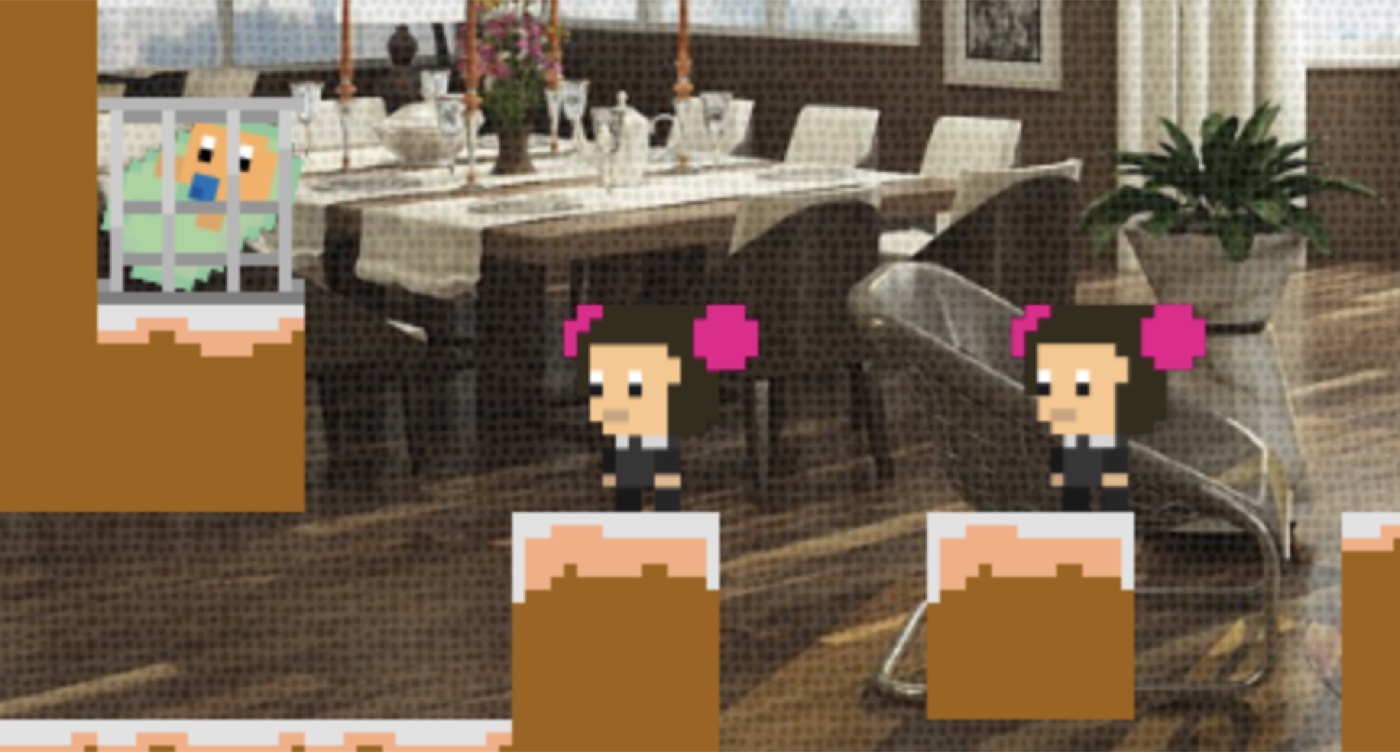
Every mechanic is taught the way the game speaks — through a themed item with a single diegetic line, introduced in isolation before it ever matters under pressure (a deliberate ABC approach to onboarding): - Keys — "All doors are open to you." - Cups — "You're the best, take your award." - Children — "The studio is your brainchild, but you also became mothers of five — catch them." - Blue blueprint — "Each project is better than the last; move to the next one." (It also acts as the checkpoint.) - And the hazards: dodge the budget, the edits and the covid, and deliver the design exactly like the render. The onboarding ends on the right note: "Luck was with you for twenty years — here, you're on your own ;)"
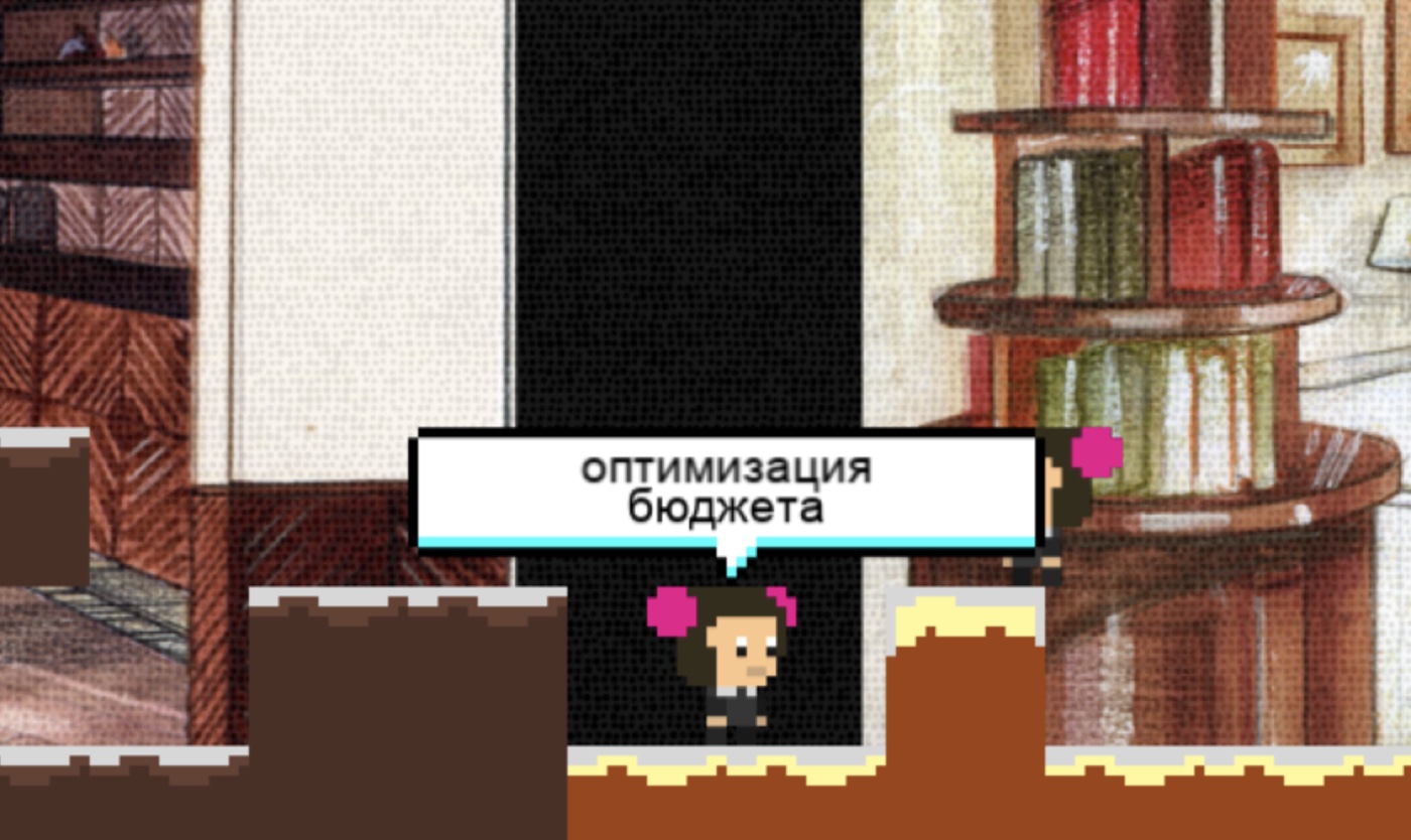
The bosses: the villains of the industry
This is where the game found its soul, and where the brief quietly changed. The brief asked for literal bosses — a foreman, a budget, "the pickiest client." What shipped instead were the abstract villains every designer actually fights, drawn cute in a pokémon register with a touch of pixel Cuphead. Most of the project's time went here. - Edits — a folded blueprint pierced by a pencil; it shoots pencils. "Don't let the edits overhaul your design!" - Budget — a pokémon-style money bag; it shoots money. "Don't let budget optimization cheapen the design!" - Man-hours (ЧЧ) — two letters "Ч" with eyes, the Russian shorthand for billable hours. "From here, edits only by extra agreement!" - The final boss — a three-headed Foreman-Client-Contractor, a three-headed Mario standing in for the on-site meeting where everyone blames the designer. "Don't let them pin it on you!"
Boss — Edits
Boss — Budget
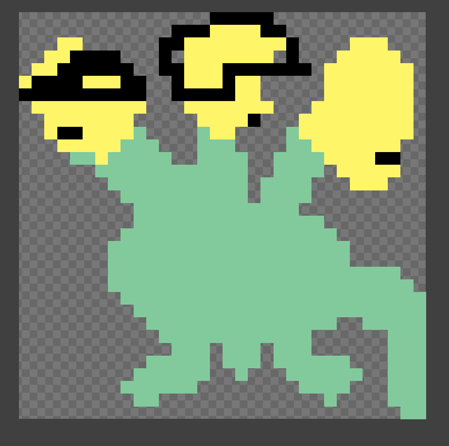
Man-hours, in combat
Four designs, one fight
The man-hours boss went through four takes — a clock with legs whose face is the dial, a round head flanked by two "Ч" antennae, a mustachioed Ч-Ч on letter-legs, and a frankly mexican Ч-Ч — before settling on the cleanest read: two separate "Ч" letters with eyes, shown here mid-fight against the sisters.
Boss — the three-headed client
The companion sister
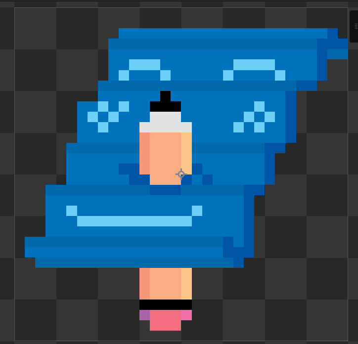
You control one sister; the other follows automatically. Keeping a follower from getting stuck in a platformer is a classic headache — and here it met a three-week deadline. Rather than burn days on pathfinding, I made the honest call: when the second sister falls behind or snags on geometry, she simply flies through the textures to catch up, masked by a little climbing-up sprite so it reads as intentional. It is a hack, and it works. (Her covid-mask variant, meanwhile, moves at double speed — a joke that became a feature.)
Art pipeline
The look is built from a few deliberate decisions: - Everything is drawn at 1× and scaled 4× — the chunky, readable Mario pixel size. - Every ground block uses the actual color palette of a specific interior, so the studio's real work is literally the terrain. - The interior references were far too detailed for a pixel game, so I wrote a dithering shader as an overlay to "pixelate" them down to the game's resolution — the brief's "redraw the references in pixel," solved as a shader rather than by hand. - The sisters' sprite was adapted from a character template in an older game of mine, Westland (zombies in the wild west). - The mobile buttons came from a pixel UI kit I already owned, recolored pink with icons drawn by hand.
Dithering an interior
Design decisions & balance
With a simple game and a hard deadline, balance meant subtracting: - No lives. Adding them would only weigh down a light experience. - One touch fails the run — which made the falling hazards and the bosses easy to tune around a single, clear rule. - Fewer falling objects per scene, sized to the screen, instead of denser chaos. - A "mushroom" gate that restricts shooting to one spot in a dedicated room right before a boss. - The blue blueprint doubles as the checkpoint; a 2/10-style counter tracks collected attributes.
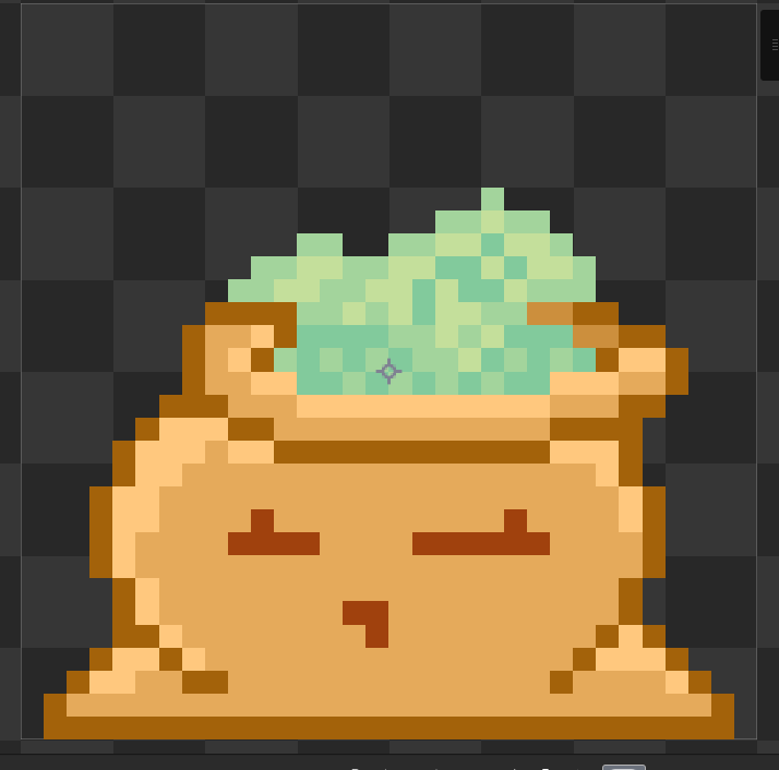
Awards as loot
The studio's real awards became drops. Breaking a single award box releases as many cups as there were actual nominations — so the World Luxury Awards 2023 box (Best Hotel, Best Spa, Best Restaurant) bursts into three, while Gold Key 2018 and the Palme d'Or years add their own. The five children are loot too: across the studio's life the two founders had five kids — Mika, Miron, Alisa, Vasilisa and Martin — each knocked from a box, on real birthdates, by the sister who is their mother.
Intro & ending
The game opens on the Super Mario logo; the sisters run up and smash it (a custom, slightly janky hand-made animation), the S+S logo appears, and a line rises: "Let's go across S+S from 2004 to 2024… and beyond." One button: Let's go. It ends the way the brief wanted — the sisters sail off on a boat toward the project of their dreams: "And beyond to your dream project!"
Web & touch
The game is HTML5 — it runs in any browser, on any computer, with no install. For phones it ships a mobile viewport and on-screen touch controls: a pixel UI kit recolored pink, with hand-drawn icons, so PC and mobile share one interface.
Easter eggs & details
- There is not a single chest in a game about the Sundukovs (sunduk means chest in Russian) — so I drew one anyway and hid it in the files.
- The sisters speak the phrases they actually say in real life — dozens of real studio one-liners float through the levels.
- Three hours vanished into the running animals (zebras, giraffes, horses) — the horses turned out too funny to stop.
- For a while one of the children, Martin, shipped as a trophy instead of a baby. He has since been promoted back to child.
Outcome
- Delivered in three weeks, solo, including all art
- The founders were delighted with it
- Played by the whole team at the founders' corporate birthday
- Made for a Forbes-featured studio — and the link is still live
- Play it: sundukovy.com/game
Takeaways
S+S is a small game that worked because of its constraints, not despite them. A fixed three-week solo budget forced clarity at every turn: no lives, one-touch failure, mechanics taught through items, a shader instead of hand-pixeling hundreds of interiors, and an honest follower hack instead of perfect pathfinding. None of it is technically fancy — and all of it served a single goal: make something deliberately simple that still has soul. The part that gave it that soul was treating the client's own history — and even the industry's frustrations, the edits and budgets and man-hours — as the game's content. The result is a gift that is unmistakably about these people, this studio, these twenty years.